Creative portfolio website: my fairy storybook build
I am a Digital Marketing graduate. See how I built a creative portfolio website as a fairy storybook, what each choice cost and a 30-second test.
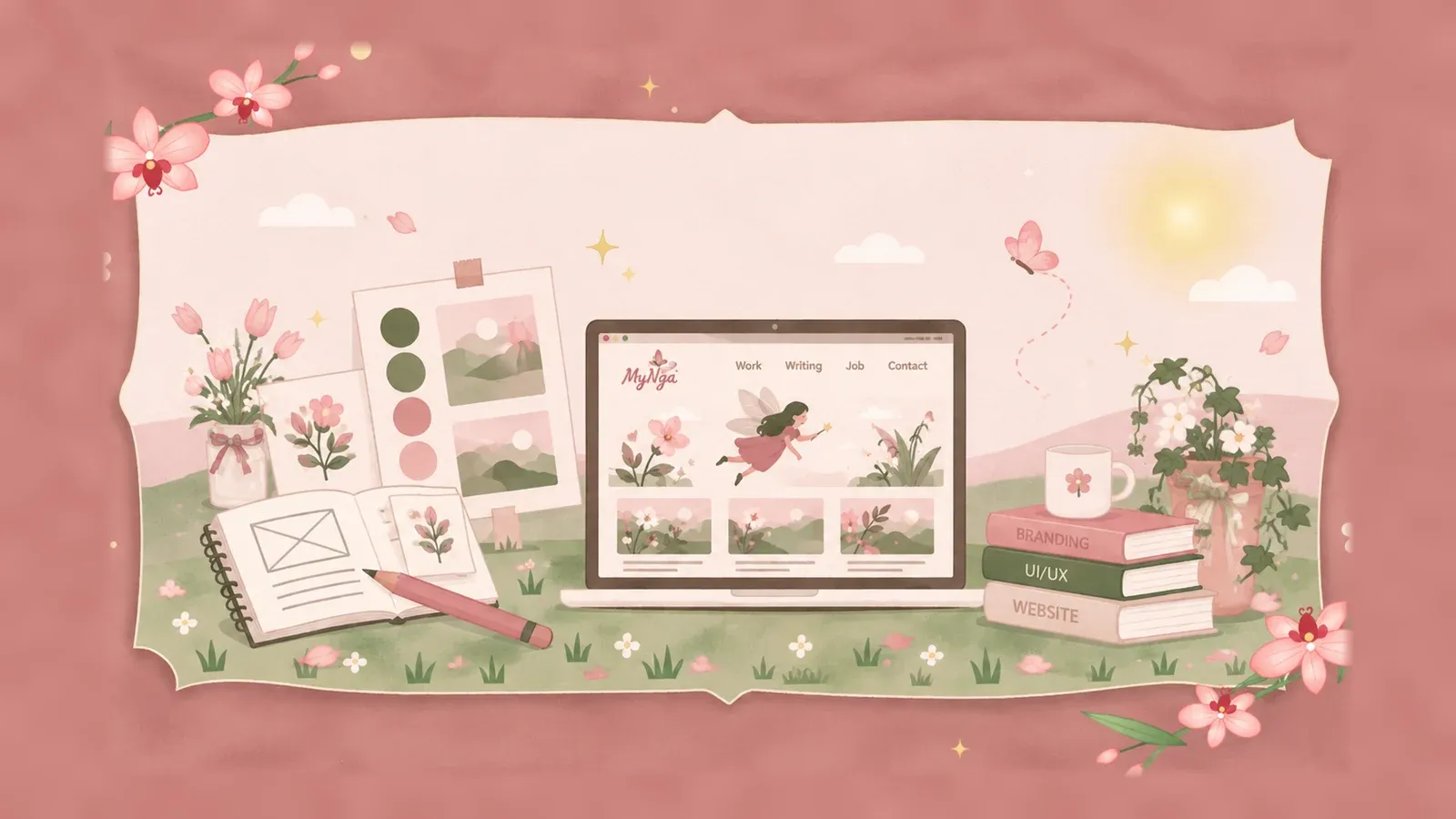
How do you build a creative portfolio website that shows who you are and still looks professional? I recently graduated with a degree in Digital Marketing, and I didn’t want my first portfolio to be a plain list of projects. So I built mine as an interactive storybook, where a little fairy walks visitors through my work.
This teardown of my portfolio comes in 7 parts, and each one starts with what I did and why, then ends with something you can copy. Here is who it is for, at a glance:
- GraduatesYou are building a first portfolio and want it to feel like you without losing clarity. Seven choices, each with its price.
- MarketersYour portfolio makes a claim before any sample does. See how plain labels keep a number honest, and run the 30-second reviewer test.
- CreativesYou want a mascot, a palette and some motion to serve the work, with a reduced-motion version built in.
Why I built something different: a portfolio that shows personality
I’m a new graduate, and I knew from day one that I wanted more than a list of projects and achievements, because I wanted a little world that reflects who I am. I love creativity, storytelling and bringing unusual ideas to life. So why would I squeeze all of that into a traditional template? It never felt right to me, and I wanted something that was uniquely mine.
What you can copy. Start from what you love to make, not from a template. Why does that matter? Because reviewers genuinely don’t read every word. Nielsen Norman Group notes that very rarely will hiring managers take the time to read your entire portfolio word for word, and Designlab warns that you have only a few seconds to connect with a visitor before they close the site.
Personality is what makes someone stop in those seconds, and I wanted my page to earn that stop. A marketing portfolio makes a claim before it shows a single sample: this person can make a brand feel like someone. If the page around the samples is a neutral template, the claim has no evidence. So my home page carries 1 line about this: “Marketing is not just telling a story. It’s making people feel it.” Shopify’s portfolio guide puts brand identity first: colors, typefaces, and images help set the tone of the site, and voice matters as much.
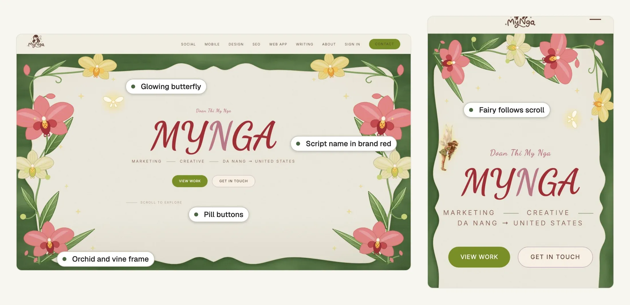
My first screen does that job before I explain anything, and it shows my name in script with the N in a deeper rose, the line “Marketing · Creative · Da Nang → United States”, and 2 buttons, View Work and Get in Touch.
Finding my visual identity: fairy, colour palette and typography
I’ve always been drawn to fairy tales, nature and whimsical illustration, so the fairy concept felt like a natural extension of my personality. I chose soft greens, pinks, floral details and hand-drawn elements because I wanted the site to be playful but still professional, and I wanted visitors to recognise that personality in the design before they read a word about me.
What you can copy. You only need a few things to carry your identity, and mine are 3: a fairy, a green orchid frame and a script name. The palette and the type below set them up, and the next section brings them to life.
Two palettes, one feeling
What I did. My home page and my blog share a feeling but not a palette. The home page is a cream paper (#F2EDE3) with pink, sage, forest green, olive, brown and gold. The blog is pure white with a handful of brand colours. I got the softness from a dusty rose (#D4A8B4) and a sage (#8B9E7A) set against a forest green (#4A6741). I built the floral frame around the hero as 2 layers, a paper still and a separate layer of flowers that move. That makes 2 palettes for 1 feeling.
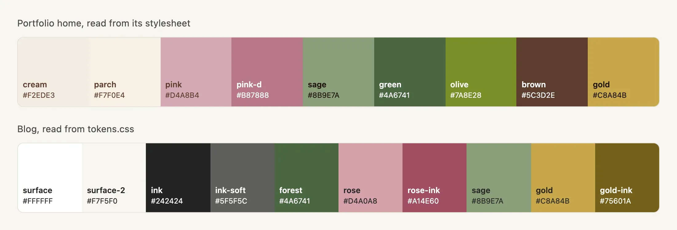
Why did the blog go white? Because of a correction recorded in its own token sheet. My 1st version used a cream paper, but that cream turned out to paint an app shell, not an article. Measured on article pages, 5 of 5 default reading surfaces were pure white. So I moved the warmth to where it doesn’t touch running text: the accent colour, the badges and one warm wash behind callouts.
Type paired by job, copy kept literal
What I did. The name on the home page is set in Dancing Script, with the N in a softer pink, and the eyebrow above it uses the same script at a smaller size. Section headings use Cormorant Garamond, small labels use Caveat and the interface text uses Inter. On the blog I separate the jobs more strictly: Geist for interface and headlines, Source Serif 4 for reading, at 20 pixels over 32 with a 680 pixel column.
Why a reviewer cares. Would I set paragraphs in a script? No, it’s a bad choice for them, so I only use it where the page is being a person: the name and the line above it. The home page can afford 4 faces because it’s a poster, but the blog can’t, because people read it.
The copy follows the same split. The blog’s masthead is “The Fairy’s Field Notes” over the headline “Where Curious Ideas Grow”, which is the character speaking in a small dose. I kept the practical parts literal, so the home navigation says Social, Mobile, Design, SEO, Web App, Writing, About, Sign in and Contact, and each one is a kind of work a hiring manager might be looking for, not a riddle.
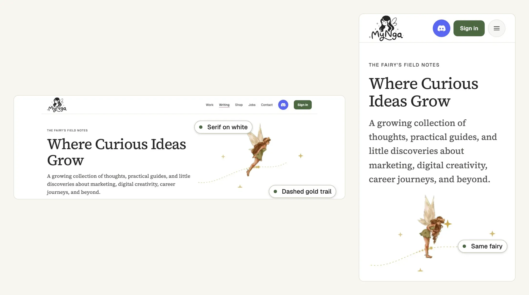
How to copy it. I’d give each typeface one job and say it out loud: this one is the name, this one is the reading. Then let your voice show in the masthead and the taglines, and keep navigation labels plain enough to scan.
Bringing my portfolio to life: illustration, mascot and animation
I didn’t want a static presentation, and I wanted an interactive storybook where a little fairy guides visitors through my projects, illustrations come to life and each section has its own character. I added the animations and small interactions to make exploring feel like an experience, not like scrolling through a résumé.
What you can copy. The motion needs a job, and the off switch gets built with it. The 2 parts below show how.
A mascot with a job, and an off switch
What I did. The fairy is the first thing the home page animates. She exists as 7 sprite sheets, one per pose (fly, flutter, sit, think, happy, tap and turn), with 8 frames each. What does a mascot that can move cost? Together the 7 PNG sheets weigh just over 1 MB, and that’s the whole price of a mascot that moves.
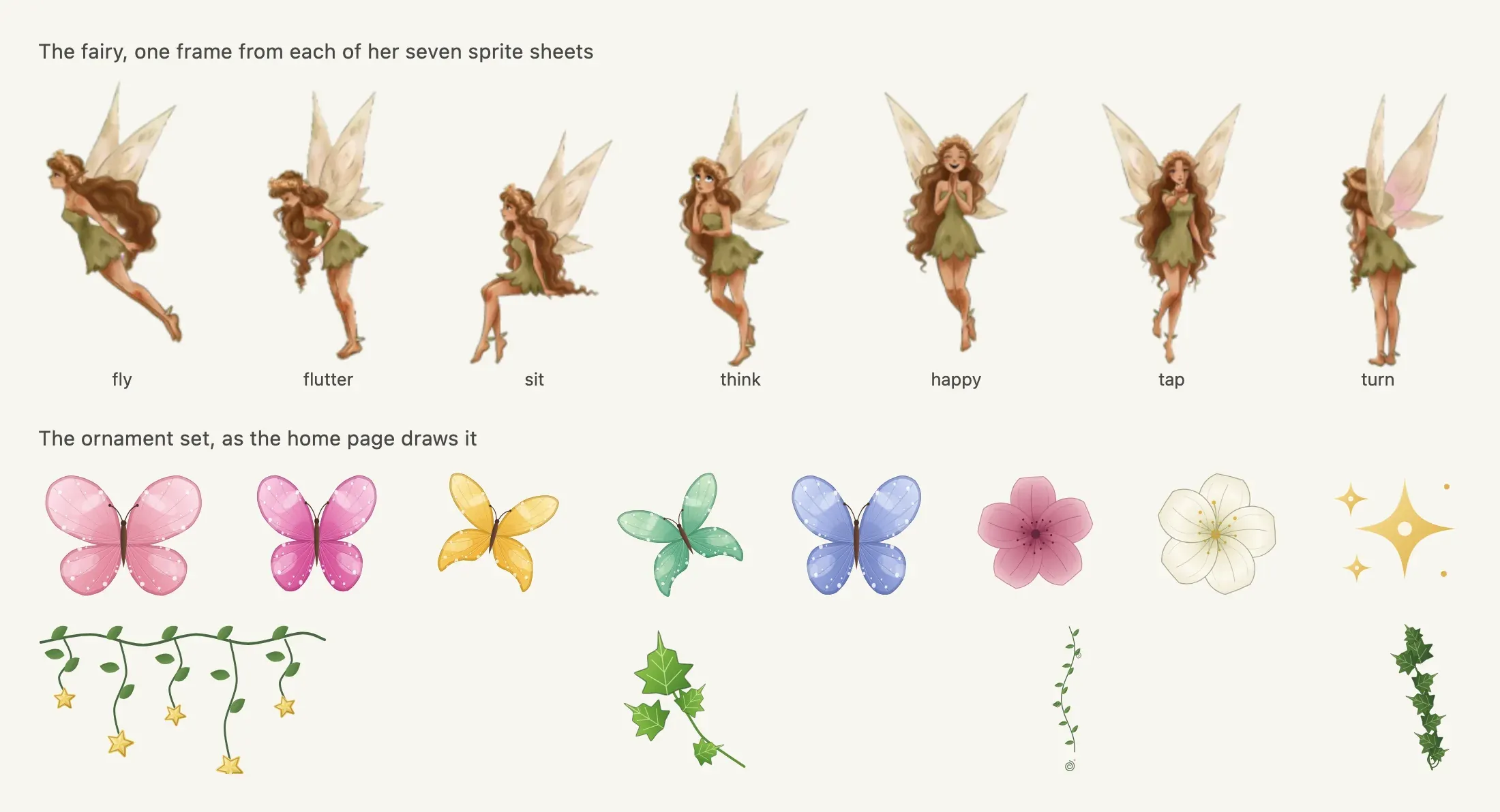
She reacts to the visitor, too: she taps when you press, looks happy when you reach a link or a button, and turns to face the way she’s moving. That’s 3 of her 7 poses at work.
I wanted her to earn her place by doing something. On pointer devices she follows the cursor on a damped spring, so she trails the pointer instead of snapping to it. A phone has no cursor to follow, so there she travels with the scroll and visits headings. I let the poses carry meaning where I place them, so she thinks beside the SEO heading, sits beside the About heading and is happy beside the contact heading.
Why a reviewer cares. A mascot with a job is a signature and a guide, while a mascot pasted in a corner is a sticker. Mine appears at section headings and edges and never over a sample, which is the rule that keeps her off the samples, so the work stays the subject.
The off switch. Motion is where personality turns into a risk, and I take that seriously. Does the browser know what a visitor prefers? It can report whether the user has asked their device to minimise non-essential motion, and MDN notes that such animation can trigger discomfort for those with vestibular motion disorders. On pointer devices my home page hides the system cursor, draws the fairy and keeps a small 15 pixel dot at the exact pointer position, with a trail of 4-point sparkles behind it. That trail doesn’t run for visitors who asked for less motion, and it doesn’t run on touch screens either. On the blog the fairy rests on her trail with the first frame of her wings, and on the home page she is fixed to the pointer instead of following on a spring.

My small interactions follow the same rule: a button lifts 2 pixels on hover, then settles back and dims slightly when it’s pressed, and a work piece rises on hover. The book below opens when you drag the cover or press Enter, and the arrow keys turn its pages.
How to copy it. If you take one thing from me, take this: pick 1 motif, decide where it appears (headings and edges) and where it never does (over your samples), then write the reduced-motion version at the same time as the effect.
One illustration vocabulary, reused
What I did. The orchid frame on the home page, the butterflies, the sparkles and the vines are one vocabulary. They repeat across sections, so a visitor learns what belongs to the site after the first screen. Vector drawings with veins, spots and shading replaced my first raster cut-outs, which looked blurry, and the butterflies keep their wing flap and the sprout keeps its single bloom, and all of them hold still when a visitor asks for reduced motion.
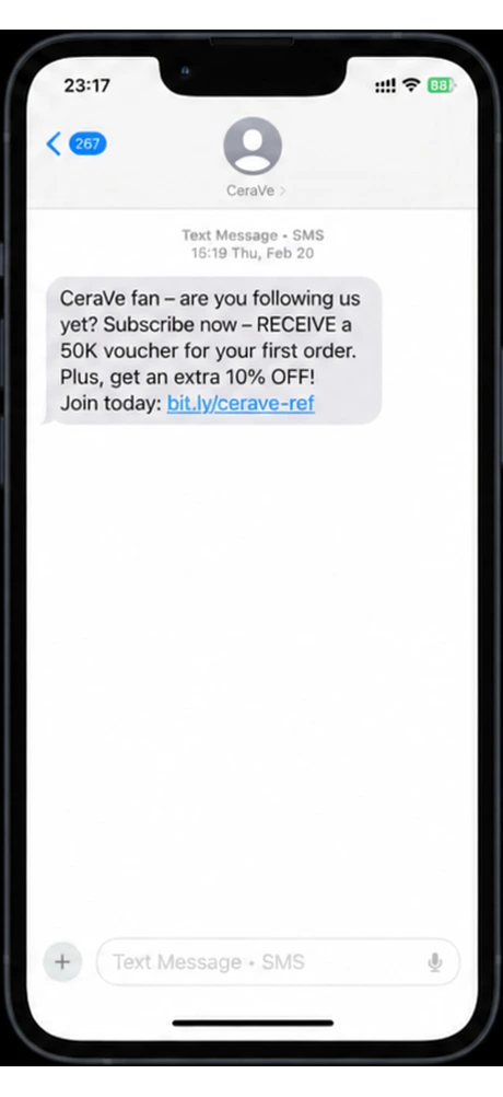
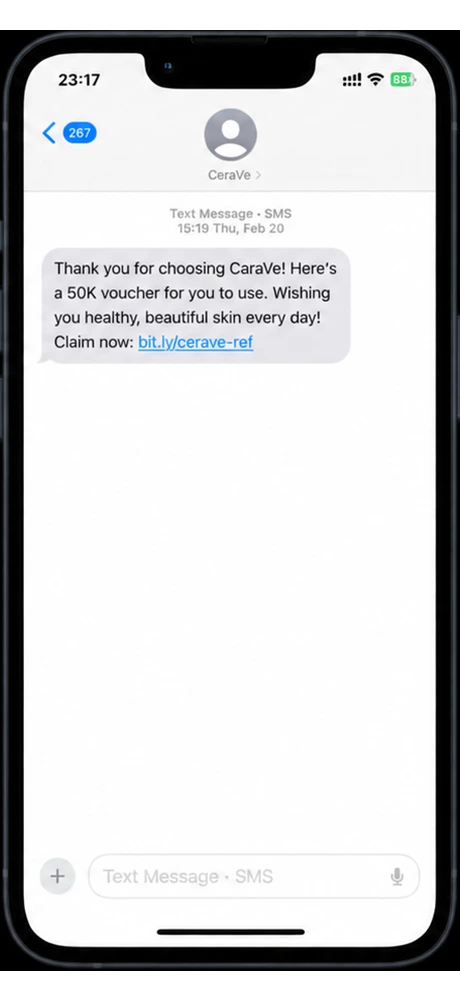
The vocabulary reaches into the work itself. I drew the Mobile Marketing chapter as a book: a green cover with a gold border and my mark that lifts to a chapter page beside phone mockups, and its pages turn through 4 channels.

Mobile
Marketing
Chapter II
Mobile Marketing
- I. SMS Messages
- II. MMS Rich Media
- III. Email Campaign
- IV. Push Notifications
Why a reviewer cares. Designlab recommends a consistent set of mockups that help unify your portfolio visually. A repeated vocabulary does that job for my whole page, and vectors stay sharp at any size where a stretched raster doesn’t.
How to copy it. I’d fix a small set of shapes and colours, reuse them in every section, and apply them to the way you present your samples too. You’ll spend more care on this than a stock photo needs.
Designing for people, not just aesthetics: UX, readability and accessibility
The biggest challenge for me was balancing detailed illustration with a clean, professional user experience. As a marketer, I know beautiful design means little if visitors can’t find what they’re looking for, so I kept the projects visible, the navigation clear and the blog comfortable to read.
What you can copy. Here are the checks I make for readability, accessibility and phones. On my blog, the reading comfort is a column of 680 pixels with text at 20 pixels over a 32 pixel line, dark ink on white, the measure Medium uses for its article body.
Contrast you can measure
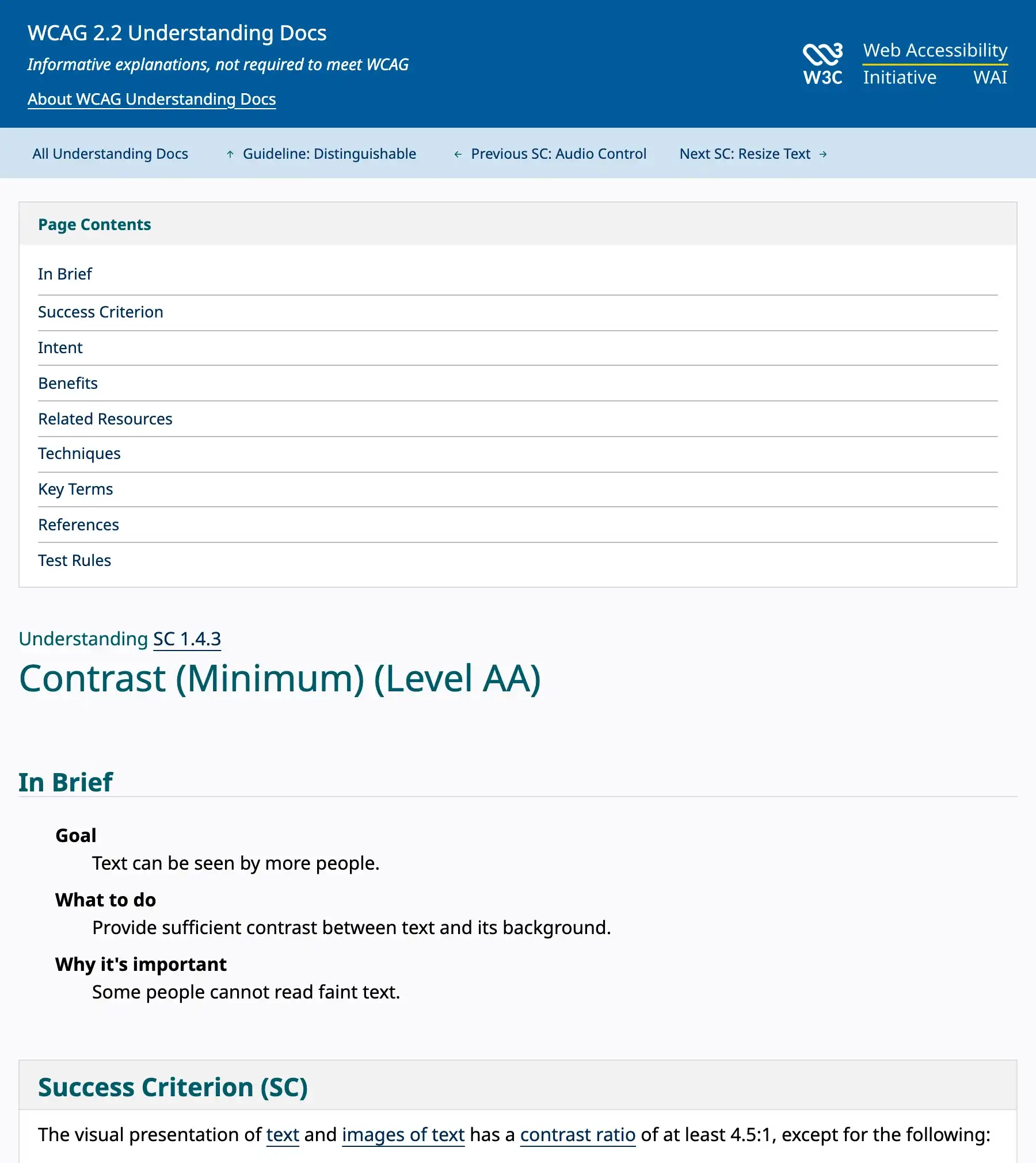
Why a reviewer cares. Low contrast reads as careless and tires the eye. The web accessibility guidelines ask for a contrast ratio of at least 4.5:1 for normal text. My blog text ink is 15.52:1 on white and the green I use for buttons is 6.35:1. The gold and the rose fail as type, at 2.29:1 and 2.24:1, so the blog uses them only as fills and keeps darker twins for type: a rose ink at 5.56:1 and a gold ink at 6.10:1. What did I do about the failing colours? I darkened them until they passed instead of dropping them completely.
How to copy it. I’d choose the identity colours first, then test each one as text on the page background. If a colour fails, keep it as a fill and darken a twin for the words. The warmth goes in the frame, and running text stays on a plain, high-contrast ground.
Motion, touch and a clear next step
Every effect above has a reduced-motion version, and I gave touch screens their own path, because a phone has no cursor to follow. Why bother with a pressed state? Because a finger never hovers, so my controls have one as well as a hover state, and a focused control gets a visible 2 pixel outline. The home navigation ends with a Contact button and my hero offers Get in Touch, so a visitor who likes the work knows what to do next. Designlab advises making the mobile experience simple and usable and giving visitors a clear call to action.
The 30-second reviewer test for your portfolio
You’ll need a phone and a timer: open your portfolio on the phone and answer these 6 prompts in order. I use this 30-second test to read a page the way a skimming reviewer does, and it’s not a standard.
- First 5 seconds. Can you say who this is and what kind of work they do? If you need to scroll, the first screen is not doing its job.
- Next 10 seconds. Count the pieces of work. Designlab puts the sweet spot at 3-5 projects, and Nielsen Norman Group heads the step choose 3-5 projects as detailed case studies.
- Next 5 seconds. Find the way to get in touch. Designlab advises a prominent “Get in touch” button as the call to action.
- Next 5 seconds. Read one body paragraph. Is the text at least 4.5:1 against its background, and is the line length comfortable?
- Last 5 seconds. Check one number or claim. Does a label next to it say what it is and what it is not?
- Then switch on reduced motion in your device settings and reload. The page should still make sense, with the effects at rest.
Making the work speak for itself: how I present projects
My portfolio brings together social media, SEO, graphic design and creative campaigns. It shows the work I’ve done growing social media communities, creating content and working on marketing projects. Does the decoration get in the way of that work? I believe creativity should always have a purpose: the design attracts attention, but the work tells the real story.
What I did. My home page names 5 chapters (social media, mobile marketing, graphic design, SEO and a web app), and the work sits 1 scroll from the first screen. A decorated page invites a suspicion that the substance is thin, so I made the proof sections deliberately literal. Where a number could be misread, the page says so next to it: “These account totals are snapshots, not my personal output or attributable growth.” Each chapter card also carries a plain tag beside the brand, such as Account snapshot, Coursework or Live product.
Why a reviewer cares. The personality raises attention, and my plain labels keep that attention from turning into doubt. A reviewer who is skimming can trust a number that carries its own limit.
How to copy it. I’d name each piece of work by what it was and what you did, and put the caveat beside the number, not in a footnote. The more decorated the page, the plainer the claims should be.
What do these choices avoid? Common portfolio mistakes
Each choice above closes off a mistake that the portfolio guides name.
| Common mistake | What the guides say | What this site does |
|---|---|---|
| Showing too much work | “less is definitely more” | Five labelled chapters, one per kind of work |
| Distracting, flashy design | Nielsen Norman Group: resist the urge to go overboard on a flashy template | The fairy stays at headings and edges, never over a sample |
| Generic or inconsistent visuals | Designlab: use a consistent set of visuals to unify the portfolio | One drawn vocabulary reused in every section |
| Poor mobile experience | Designlab: make the mobile experience simple and usable | A phone path for the fairy and a mobile menu |
| Low-resolution or heavy images | Image resolution and file size can be tricky | Vector ornaments; the 2 MB About video preloads nothing |
| No call to action | Designlab: tell visitors what to do | A Contact button in the navigation and “Get in Touch” in the hero |
The trade-offs behind the magic: performance and design costs
There were trade-offs. Sometimes I simplified an illustration, reduced an animation or chose a more readable layout over something visually exciting. A strong personal brand isn’t about adding every creative idea, it’s about choosing the details that make the experience better.
What you can copy. Every idea needs a price before you keep it. Here’s the price of mine, in weight and in upkeep: just over 1 MB of sprite sheets, 4 faces on the home page and a loop of about 2 MB. 2 of the choices below are plain on purpose: the blog stays white, and the fairy rests when a visitor asks for less motion.
| Choice | What it bought | What it cost |
|---|---|---|
| Fairy mascot with poses | A face for the site on every device | Just over 1 MB of sprite sheets, and a rule to keep her off the samples |
| Two palettes | A poster home page and a readable blog | Two sets of colours to keep consistent |
| Script name, serif reading | Personality where it fits, comfort where it counts | Four faces on the home page |
| Vector ornament set | Sharp art at any size, one vocabulary | More care than stock images |
| Cursor and sparkles | Delight for visitors with a pointer | A hidden system cursor, plus a reduced-motion path to maintain |
| Fairy portrait loop | A moving About page | A file of about 2 MB, held back until needed, with a 175 KB still as its poster |
What building my portfolio taught me about personal branding
Building this portfolio taught me that personal branding is about understanding yourself and finding a creative way to communicate it. I didn’t hide my playful personality to look professional, because creativity and professionalism can coexist.
Here’s what I’d pass on:
- Pick one character or motif and give it a job. A mascot that sits beside headings and reacts to the cursor is a system. A mascot pasted on a corner is a sticker.
- Let the personality live in the frame. Keep running text on a plain, high-contrast ground.
- Check contrast before you fall in love with a colour. If a brand colour fails as type, use it as a fill and darken a twin for text.
- Build the off switch with the effect. Reduced motion and touch screens are visitors too.
- Label your proof in plain words. The more decorated the page, the plainer the claims.
I didn’t just build a portfolio to show what I’ve done. I built a little world that shows who I am.
FAQ: how to make a portfolio stand out
How many projects should a creative portfolio website show?
Fewer than you think, and 3-5 is the number both guides give. Designlab says the sweet spot typically lies in the 3-5 range, and Nielsen Norman Group suggests 3-5 projects as detailed case studies. My home page shows 5 chapters, and each one says what the work was.
Will a mascot or illustration make my portfolio look unprofessional?
Not when it has a job and stays out of the way of the work. Mine appears at headings and edges, never over a sample, and every effect has a reduced-motion version. The risk the guides name is decoration that distracts from the content, which is why I keep my proof sections literal.
How do I choose colours for a personal branding portfolio?
I’d start with the identity, because Shopify puts brand identity first, then test every colour as text. The accessibility guideline asks for at least 4.5:1 for normal text. Colours that fail can still work as fills, with a darker twin for words.
Will reviewers read my write-ups?
Probably not in full, so I’d keep them short and lead with what I did. Shopify’s advice for work descriptions is to keep it short, and one hiring manager quoted by Nielsen Norman Group says “Don’t just show me the finished product.”
Should I write about how I built my own portfolio?
Yes, if you write it from experience. Google’s guidance on helpful content asks whether your content clearly demonstrates first-hand expertise and a depth of knowledge. A teardown of your own site, with the real choices and what they cost, is first-hand by construction.
If you’re planning a creative portfolio of your own, I hope the trade-offs above save you a few detours. To see it all together, the portfolio is the place to start, and the blog shows the quieter version of the same identity. You can reach me through the contact page.
This is a first-person account of my own site, not a design standard. The linked sources set the contrast, reduced-motion and portfolio guidance; every other claim describes this site as built.
Sources:Designlab - 14 Common UX Portfolio Mistakes to Avoid for Career Success, Nielsen Norman Group - 5 Steps to Creating a UX-Design Portfolio, Shopify - How To Build a Portfolio Website in 9 Simple Steps, W3C - Understanding Success Criterion 1.4.3: Contrast (Minimum), MDN - prefers-reduced-motion, Google Search Central - Creating helpful, reliable, people-first content.
US jobs that tell you if they sponsor.
- Every posting states its visa stance
- Filter by role, visa and state
- Links to the employer's own listing
$8a month, cancel any time
See Visa JobsJoin Visa Radar on Discord
A free community for people moving to the US on a J-1, F-1/OPT or work visa.
Free when you join
- A job post every day
- Answers to your visa questions
- Wins from people on the same path
Responses
Keep reading
These industries employ the most immigrants
Professional and administrative services employ the most immigrants in the United States, while agriculture and construction have the highest share. Here is the sector and industry breakdown, and where graduates on F-1, OPT or J-1 will find the most company.
Cap-exempt H-1B employers: who qualifies and what changed in 2026
Universities, their affiliated nonprofits and research organizations can file H-1B petitions outside the 65,000 cap. Here is who counts, what the 2026 fee news says about them, and which dates are still open.
How to check which employers actually sponsor H-1B
A posting that says it will sponsor is not a filing record. Check the USCIS employer data, the Labor Department filings, the debarment list and the posting itself, in that order.